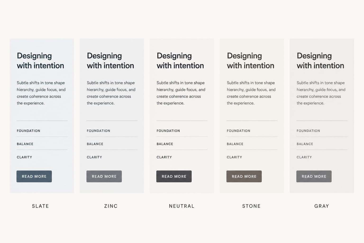
Tailwind ships five gray families. They look identical in IntelliSense.
They do not look identical on a settings card.
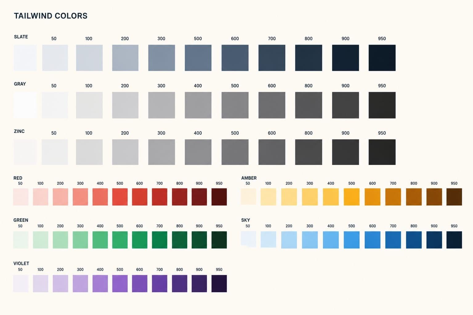
I rendered the same UI in slate, gray, zinc, neutral, and stone so you can stop guessing. If you want every Tailwind color, including the chromatic scales, use the full palette cheat sheet. This page is only the neutrals.
Tailwind ships five grays. That is the bug.
slate, gray, zinc, neutral, and stone each have a 50–950 scale. None of them is named “the gray you should use.”
That is generous for a prototype. On a product, it is how you get border-zinc-200 on a bg-slate-50 page with text-stone-700 labels. Each class is valid. The page looks slightly dirty and nobody can say why.
The families are not interchangeable:
| Family | Cast | When it works | When it fights you |
|---|---|---|---|
slate | Cool, blue | Dashboards, code products, anything already using blue | Photography, warm brands, paper-like marketing |
gray | Cool, weaker than slate | If you already standardized on it | You probably wanted zinc |
zinc | True gray | Product chrome, SaaS shells, dark mode | Warm editorial pages |
neutral | True gray, a hair flatter than zinc | Same jobs as zinc | Almost never worth a second family next to zinc |
stone | Warm, brown | Editorial, docs, paper UI | Cool blue brands, most dashboards |
slate
gray
zinc
neutral
stone
The same card, five families
Every card below uses that family’s 50 background, 200 border, 900 heading, 700 body, 500 meta, and a 900 button. The copy is identical. Only the gray changes.
slate
Workspace settings
Members can invite teammates and change billing. Guests stay read-only.
Last edited 2 hours ago
gray
Workspace settings
Members can invite teammates and change billing. Guests stay read-only.
Last edited 2 hours ago
zinc
Workspace settings
Members can invite teammates and change billing. Guests stay read-only.
Last edited 2 hours ago
neutral
Workspace settings
Members can invite teammates and change billing. Guests stay read-only.
Last edited 2 hours ago
stone
Workspace settings
Members can invite teammates and change billing. Guests stay read-only.
Last edited 2 hours ago
Look at the borders and the muted timestamps before you look at the buttons.
Slate’s border goes blue-gray. Stone’s border goes taupe. Zinc and neutral stay gray. If you put slate chrome next to a zinc dropdown, the dropdown will look like it came from another file. Because it did.
The same cards on a dark surface
Dark mode is where a “close enough” gray falls apart. slate-950 is blue-black. stone-950 is brown-black. zinc-950 is just black with room for zinc-900 cards to sit on top.
slate
Workspace settings
Members can invite teammates and change billing. Guests stay read-only.
Last edited 2 hours ago
gray
Workspace settings
Members can invite teammates and change billing. Guests stay read-only.
Last edited 2 hours ago
zinc
Workspace settings
Members can invite teammates and change billing. Guests stay read-only.
Last edited 2 hours ago
neutral
Workspace settings
Members can invite teammates and change billing. Guests stay read-only.
Last edited 2 hours ago
stone
Workspace settings
Members can invite teammates and change billing. Guests stay read-only.
Last edited 2 hours ago
A rule that saves arguments: the page is 950, the card is 900, the border is 800, body text is 300, meta is 500. Stay inside one family for all of those.
slate-300 body text on zinc-950 is the dark-mode version of mixing families. You will feel it before you name it.
How slate, zinc, and stone actually differ
Ignore gray and neutral for a minute. They are the in-between options. The decision is usually slate vs zinc vs stone.
Slate is blue. Compare slate-500 (#64748b) to zinc-500 (#71717a). Slate has a hue. That is why it pairs cleanly with blue-600 buttons and why it looks wrong on a cream marketing page.
Zinc is gray. No hue to reconcile with your accent. That is why I use it on product UI. Headings, borders, and disabled states stay out of the brand color’s way.
Stone is brown. stone-500 (#78716c) sits closer to ink on paper than to a macOS sidebar. It is the right call for blogs and docs. It is a bad call for a billing table.
neutral is zinc’s quieter twin. neutral-50 and zinc-50 are both #fafafa. The mid-scale is where they drift: neutral-500 is #737373, zinc-500 is #71717a. I have never needed both in one codebase.
gray is the leftover name. It is cooler than zinc and less blue than slate. If you are starting fresh, skip it. The word “gray” in class names is useful. Alias zinc to gray and you get a clear name without a sixth family.
Which gray I pick
For an app shell, zinc.
I want chrome that does not argue with the accent. Zinc does that in light and dark. I alias it to gray so the rest of the team types bg-gray-50 and never discovers stone.
For this site, stone-ish warmth, but not by mixing Tailwind’s stone utilities into a zinc app. Yuurrific’s surfaces are custom olive tokens, not bg-stone-50. That is the point. Pick a direction on purpose. Do not inherit five directions from the default theme.
For a blue SaaS that already uses slate everywhere, stay on slate. Migrating a mature codebase from slate to zinc is a week of diffs for a change most users will not name. Consistency beats the theoretically better gray.
Never pick two.
Lock one family so the team cannot mix them
Choosing zinc in a Slack thread does nothing. IntelliSense will still offer slate-700 tomorrow.
In Tailwind v3, replace the color map and alias the winner to gray:
const colors = require('tailwindcss/colors');

/** @type {import('tailwindcss').Config} */
module.exports = {
  theme: {
    colors: {
      transparent: 'transparent',
      current: 'currentColor',
      white: colors.white,
      black: colors.black,
      gray: colors.zinc,
      blue: colors.blue,
      red: colors.red,
      emerald: colors.emerald,
    },
  },
};
In Tailwind v4, write the zinc scale onto --color-gray-* and stop exposing the other four families. The palette guide has the v4 snippet and the opacity-token pattern.
After that, bg-slate-50 should fail. If it still works, you extended the theme instead of replacing it.
What this does not decide for you
A gray family is chrome. It is not a brand.
You still need a primary, a destructive, and a rule for when text is 900 vs 700. Zinc will not save a page that uses blue-400, indigo-500, and sky-600 on the same dashboard.
It also will not fix contrast. text-zinc-400 on bg-zinc-50 is legal Tailwind and a bad label. Check the pair, not just the family.
FAQ
What is the difference between Tailwind slate and zinc?
Slate is a cool blue-gray. Zinc is a true gray with no hue. Use slate next to blue product UI. Use zinc when you want chrome that stays out of the accent’s way.
Should I use Tailwind gray, zinc, or neutral?
If you are starting now, use zinc and alias it to gray. Skip gray and neutral as separate families. Neutral is close enough to zinc that a second scale only creates mix-ups.
Which Tailwind gray is best for dark mode?
Zinc. zinc-950 / zinc-900 / zinc-800 stack without a blue or brown cast. Slate dark mode looks navy. Stone dark mode looks muddy.
Can I mix slate backgrounds with zinc text?
You can. You should not. The mismatch is visible on borders and disabled states first. Pick one family for surfaces, text, and borders.
How do I remove extra Tailwind grays?
Do not extend the default theme. Replace theme.colors (v3) or map a single scale onto --color-gray-* (v4) so the other families stop existing as utilities.
What to do next
Scroll back to the cards. Pick the family that looks like your product, not the one with the nicest name.
Then lock it in config so the other four cannot leak back in. For hex values, class names, and the rest of the default theme, use the Tailwind color palette.