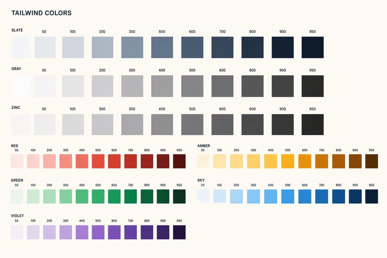
Most “Tailwind colors” results show you a config lecture. You wanted the palette.
Here it is: every default base color, the 50–950 shade scale, hex values you can copy, and the class names that produce them. After that I will tell you why I still delete most of this in production.
Click a swatch to copy the hex. Class names follow bg-{name}-{shade}.
slate
Cool, slightly blue. Default for most product UI.
gray
Balanced, a little cooler than true gray.
zinc
True gray. No blue, no brown.
neutral
Also true gray. Almost zinc, slightly flatter.
stone
Warm, a hint of brown. Editorial and paper UI.
red
Errors, destructive actions
orange
Warnings, warmth
amber
Attention without alarm
yellow
Highlights. Hard on small text.
lime
Success with more punch than green
green
Success, positive status
emerald
Success, a bit more jewel-toned
teal
Between green and cyan
cyan
Info, links on dark UI
sky
Lighter, friendlier than blue
blue
Primary actions, links
indigo
Primary when blue feels generic
violet
Accent. Distinct from purple.
purple
Accent. Warmer than violet.
fuchsia
Loud accent. Use sparingly.
pink
Accent, marketing highlights
rose
Softer than red for emphasis
What Tailwind base colors actually are
Tailwind ships a named color system, not a random bag of hex codes.
A base color is the family name: slate, zinc, blue, rose. Each family is a scale of 11 shades from 50 (almost white) to 950 (almost black). You never write bg-#64748b. You write bg-slate-500.
That mapping is the whole trick. Designers think in hex. The stylesheet thinks in family-shade. If you know both, you can read a Figma file and a React tree without translating in your head.
The default theme also includes white, black, transparent, and current. Those are not scales. They are single tokens.
This palette is the same in Tailwind v3 and v4. The config syntax changed. The hex values did not.
| Shade | Typical job | Example |
|---|---|---|
| 50–100 | Page and card backgrounds | bg-zinc-50 |
| 200–300 | Borders, dividers, input rings | border-zinc-200 |
| 400–500 | Icons, placeholders, muted UI | text-zinc-500 |
| 600–700 | Body text, secondary buttons | text-zinc-700 |
| 800–950 | Headings, dark surfaces | bg-zinc-950 |
How class names map to hex
Pick a family, pick a shade, prefix the property.
| What you want | Class | Hex if you used slate |
|---|---|---|
| Page background | bg-slate-50 | #f8fafc |
| Card border | border-slate-200 | #e2e8f0 |
| Muted label | text-slate-500 | #64748b |
| Body text | text-slate-700 | #334155 |
| Heading | text-slate-900 | #0f172a |
| Primary button | bg-blue-600 | #2563eb |
| Destructive | bg-red-600 | #dc2626 |
Opacity modifiers work on scale colors: bg-slate-900/80, text-blue-600/60. They do not work on a bare hex token you drop into config unless you store the color in a format that accepts alpha. More on that below.
If you searched for a typo like taiwind colors or tailwind colros, you still want this page. Google already folds those queries here. The class you meant is bg-{color}-{shade}.
Slate vs zinc vs the other grays
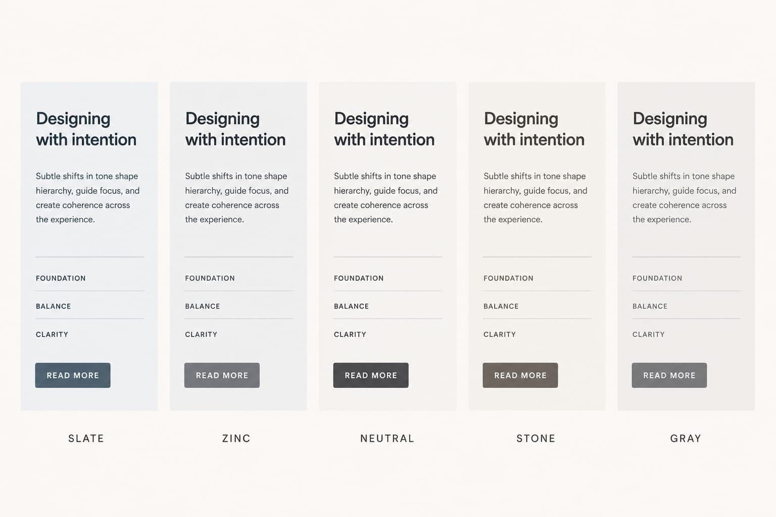
Tailwind does not ship one gray. It ships five: slate, gray, zinc, neutral, and stone.
They look interchangeable in a dropdown. They do not look interchangeable on a card sitting on a page.
- Slate leans blue. Fine for dashboards. Cold next to photography.
- Zinc and neutral are true grays. Zinc is the one I reach for on product UI.
- Gray sits between slate and zinc. I almost never need it if zinc exists.
- Stone leans brown. It matches paper and editorial layouts. It fights a cool blue brand.
slate
gray
zinc
neutral
stone
I wrote a separate comparison with the same card rendered in each family, light and dark: Every Tailwind gray compared. If you are choosing a neutral, read that before you pick three.
Two palettes I actually ship
The full default theme is a catalog. A product needs a grocery list.
Minimal SaaS dashboard
| Role | Token | Why |
|---|---|---|
| Surfaces | zinc-50, zinc-100, white | Neutral chrome that does not compete with data |
| Borders | zinc-200 | Visible without looking sketched |
| Text | zinc-900, zinc-600, zinc-500 | Heading, body, meta |
| Primary | blue-600 | Predictable for buttons and links |
| Danger | red-600 | One red, used for destructive only |
| Success | emerald-600 | Not the same as primary blue |
I keep one accent. If the brand is already blue, I do not also introduce indigo and sky “for variety.” Variety is how dashboards start looking like a theme park.
Dark UI
| Role | Token | Why |
|---|---|---|
| Page | zinc-950 | True black-adjacent without crushing contrast |
| Elevated surface | zinc-900 | Cards have to sit on the page |
| Border | zinc-800 | zinc-700 is too loud on dark |
| Text | zinc-50, zinc-300 | Headings vs body |
| Muted | zinc-500 | Meta, timestamps |
| Primary | blue-500 | blue-600 goes muddy on dark |
Do not mix slate text with zinc backgrounds. That is the “why does this feel slightly off?” bug. Pick one family for chrome and stop.
Stop using the full palette in production
The defaults are great for prototypes. On a product with a brand, they become noise.
Too many neutrals invite inconsistent choices. The same goes for near-duplicates like violet and purple. Once those classes land in components, cleaning them up is busywork.
Treat the default theme as a catalog you pick from, not an aisle you leave open.
Replace default colors instead of extending them
theme.extend.colors keeps every default color and adds yours on top. That is the opposite of a constrained palette.
Override theme.colors and whitelist what the project uses:
const colors = require('tailwindcss/colors');

/** @type {import('tailwindcss').Config} */
module.exports = {
  theme: {
    colors: {
      transparent: 'transparent',
      current: 'currentColor',
      white: colors.white,
      black: colors.black,
      blue: colors.blue,
      red: colors.red,
      violet: colors.violet,
      gray: colors.zinc,
    },
  },
};
Always keep transparent and current. Drop them and utilities like bg-transparent disappear.
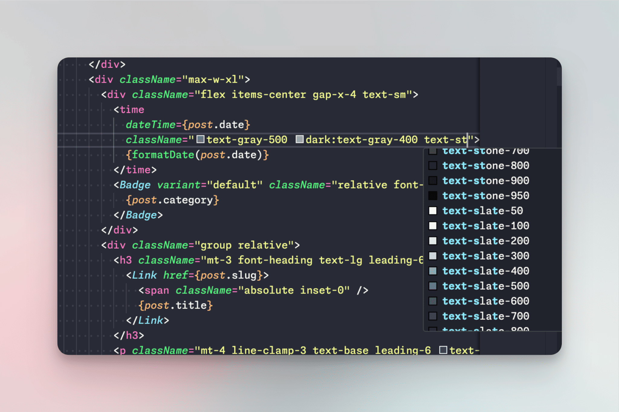
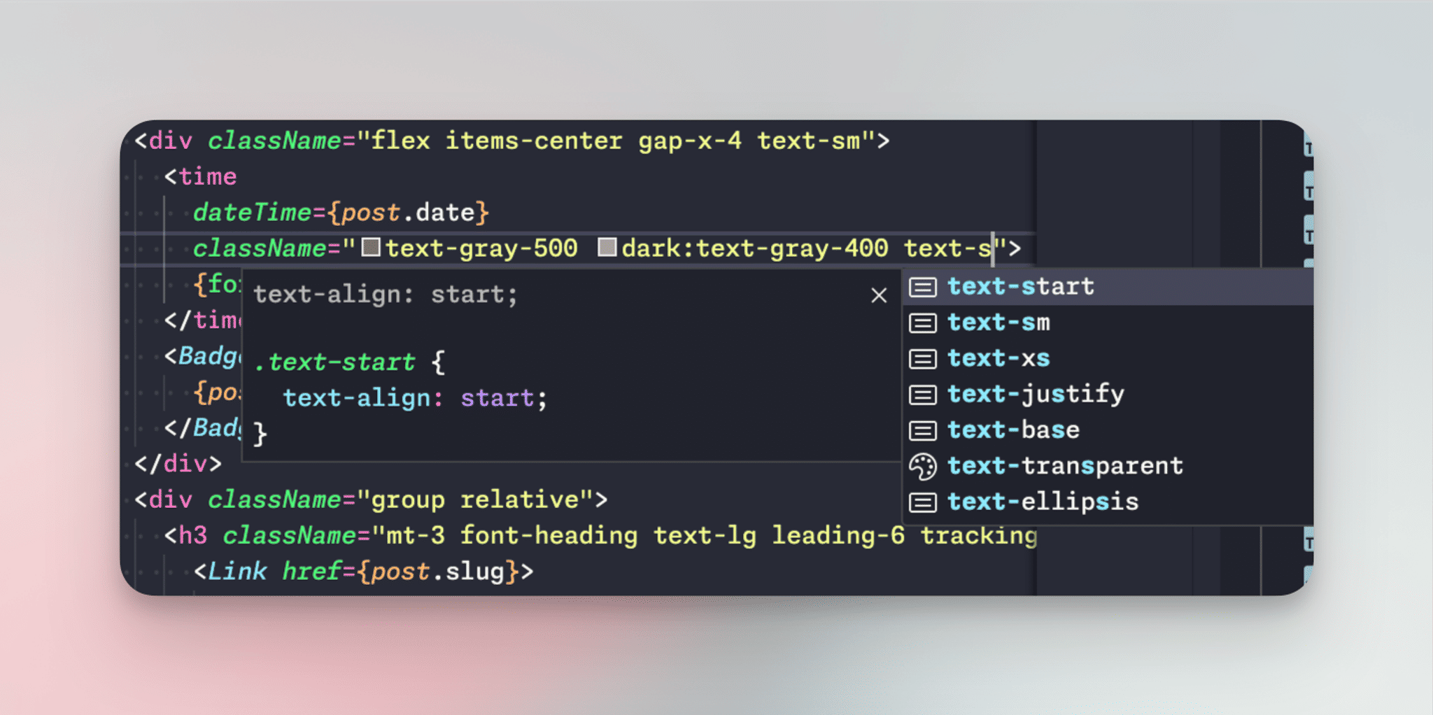
After this change, IntelliSense stops suggesting slate-700 or fuchsia-400. That friction is the feature.
Before
After
Tailwind v4: same idea, CSS theme tokens
This site runs Tailwind v4. The constraint still belongs in the theme, just not in tailwind.config.js.
@import "tailwindcss";

@theme {
  --color-gray-50: #fafafa;
  --color-gray-100: #f4f4f5;
  --color-gray-200: #e4e4e7;
  --color-gray-300: #d4d4d8;
  --color-gray-400: #a1a1aa;
  --color-gray-500: #71717a;
  --color-gray-600: #52525b;
  --color-gray-700: #3f3f46;
  --color-gray-800: #27272a;
  --color-gray-900: #18181b;
  --color-gray-950: #09090b;
}
That aliases zinc onto gray-* so the team has one obvious neutral. You can still import a chromatic scale by keeping --color-blue-* and dropping the families nobody should touch.
Name colors by role, not by hue
text-gray-700 tells you the shade. It does not tell you why that shade exists.
/** @type {import('tailwindcss').Config} */
module.exports = {
  theme: {
    extend: {
      colors: {
        brand: '#1fb6ff',
        accent: '#7e5bef',
        warning: '#ff9800',
      },
    },
  },
};
bg-warning and text-brand read like intent. When the brand blue changes, you update one token instead of hunting blue-* classes.
A split that holds up:
- Scales (
primary-100…primary-900) for surfaces, borders, and text - Semantic singles (
warning,success,danger) for status
If you are converting print or design-tool values (CMYK, Pantone, HSL) into hex first, I use cmyktopantone.com/convert-color before the values hit config.
HEX tokens break opacity modifiers
A bare #1fb6ff does not support bg-brand/50. Tailwind’s opacity modifiers need a color format that accepts alpha.
Use a shade object from tailwindcss/colors, or CSS variables with <alpha-value>:
@tailwind base;
@tailwind components;
@tailwind utilities;

@layer base {
  :root {
    --color-primary: 255 115 179;
    --color-secondary: 111 114 185;
  }
}module.exports = {
theme: {
colors: {
primary: 'rgb(var(--color-primary) / <alpha-value>)',
secondary: 'rgb(var(--color-secondary) / <alpha-value>)',
},
},
};Then text-primary/50 works, and dark mode is a variable swap instead of a class rewrite.
Trade-offs worth deciding up front
| Approach | Use when | Watch out for |
|---|---|---|
| Keep the full default palette | Prototypes, internal tools, one developer | Teams will mix slate and stone |
Replace theme.colors | You want a hard limit on utilities | Re-add transparent, current, and anything you still need |
Import a shade scale (colors.blue) | You need 50–950 and opacity works | It is still Tailwind’s blue, not your brand hex |
| Single HEX tokens | Brand values are fixed and opacity is rare | bg-brand/50 will not work |
CSS variables + <alpha-value> | Dark mode, multi-brand, frequent opacity | Slightly more setup |
My default for product work: one neutral aliased to gray, a small set of semantic tokens, and CSS variables if theming or opacity matters.
What this does not fix
A tight palette will not invent a design system. You still need rules for when brand appears on buttons versus links, and how dark surfaces use the same tokens.
It also will not pick your gray for you. That decision is visual. Use the slate vs zinc vs neutral comparison and then lock the winner in config.
FAQ
What are all the Tailwind color names?
The default families are slate, gray, zinc, neutral, stone, red, orange, amber, yellow, lime, green, emerald, teal, cyan, sky, blue, indigo, violet, purple, fuchsia, pink, and rose, plus black, white, transparent, and current.
What hex is slate-500?
#64748b. Click the swatch in the palette above. Every shade in this post uses Tailwind’s default hex values.
Should I use theme.colors or theme.extend.colors?
Use theme.colors when you want to remove defaults. Use theme.extend.colors when you are adding a few named tokens on top of a palette you already trimmed. Extending the stock theme keeps every default color available.
Why doesn’t bg-brand/50 work with my HEX color?
Opacity modifiers need a color format that accepts an alpha channel. A bare #1fb6ff string does not. Use a shade object from tailwindcss/colors, or the rgb(var(--token) / <alpha-value>) pattern.
Do I still need transparent and current?
Yes, if you override theme.colors. Those utilities come from the color map. Leave them out and bg-transparent and text-current stop working.
Is one neutral enough for a large app?
Usually yes for UI chrome. If marketing pages need a warmer gray than the app shell, define a second named token (gray-warm or surface) instead of quietly reintroducing stone and zinc side by side.
What to do next
Copy the hex you came here for. Then pick one gray family and stop mixing them.
If you are still staring at five neutrals, start with the side-by-side gray comparison. If you already know the family, open config and delete the rest.